Pretty in Pink
October 24, 2014
In honor of Breast Cancer Awareness month, I decided to focus on pink!—which just so happens to be my favorite color as well.
In honor of Breast Cancer Awareness month, I decided to focus on pink!—which just so happens to be my favorite color as well.
I think it’s a common misconception that pink is girly and meek. I think it can be quite the opposite! Pink, especially in a bold tone, is daring, strong, and while still feminine, it is impactful and confident. (It makes sense now that pink is the color of breast cancer awareness, right?) I’m not suggesting that everyone should run out to purchase a few gallons of bubblegum pink paint to wash their walls with, however I do think that used appropriately, pink is an incredible color that is sometimes ignored in interiors due to its gender specificity.
Try mixing pink with navy blue, silver and gold, or a milk chocolate brown for a unique and striking color combo.
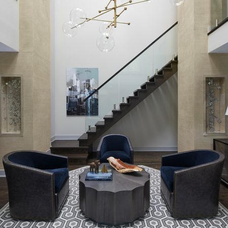
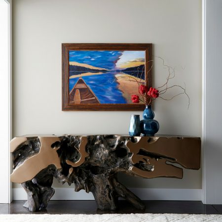
Here are a few fabulous pink spaces! Do you love or loathe?
 Photo Courtesy of ladolcevita.com
 Photo Courtesy of verandamagazine.com
 Photo Courtesy of splendidsass.blogspot.com
 Photo Courtesy of decorpad.com
 Photo Courtesy of momtrends.com
 Photo Courtesy of lucitelavender.com

Share


You Might Also Like

Find us on Instagram