Our Pet Peeves
March 22, 2017
If you’re a foodie you shudder when a chef uses artifical vanilla. If you’re a fashion designer you cringe when someone wears an outfit that's all wrong for them. Interior designers have pet peeves too!
We all have pet peeves. If you’re a foodie you know when the chef has used fake truffle oil or artificial vanilla. If you’re a fashion designer you cringe when someone wears an outfit that's all wrong for them. Interior designers have hot button issues, too! Here are a few of the mistakes we love to hate:
Susan: Too many family photos in mixed sizes and frames
If you have too much of anything people won’t know where to focus their attention, as in this photo array just below. Keep it Simple and Sweet (KISS) - choose a few favorites, as in the next photo, and limit the number of frame styles and colors. Sweet harmony!

Too many photos! Photo Courtesy of ArchitecturalDigest.com

Photo Courtesy of PhotographerintheFamily.com
Susan: Art that is too small
People almost never err on the side of art that is too big, but they often put a tiny painting sculpture in a large space - check the photo just below. Artwork shouldn’t look like a postage stamp floating on an envelope. We chose a single, large piece of art for the family room fireplace in the second photo. Talk about big impact!

Art too small! Photo Courtesy of BHG.com

Photo Courtesy of Sweet Peas Design
Susan: Impersonal living spaces
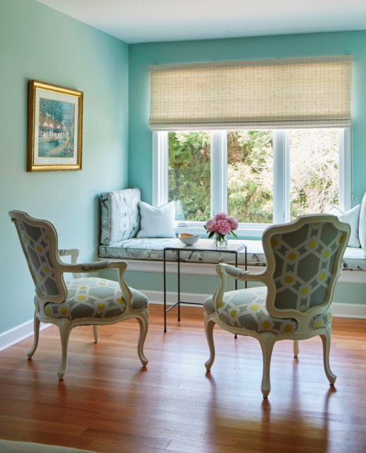
You know the ones, the homes that give you no clues about who lives there, such as the living room below. The artwork and accessories are generic or nonexistent. The colors are blah. It’s your home, let your inner spirit shine through! Can't you just picture a family enjoying their coffee and croissants in the cheerful bedroom nook in the second photo?

Impersonal living space. Photo Courtesy of HouseBeautiful.com

Photo Courtesy of Sweet Peas Design
Senior Designer Angela Lavista: Furniture stores that encourage customers to buy a whole room of matching furniture
We’ve all seen these boring groupings - sofa, giant chair-and-a-half and ottoman, all in the same fabric, as in the first photo below. Furniture stores should know better! It is much more appealing to mix it up when furnishing a room. If you want to dip a toe in that water, start with an ottoman in a different color and fabric than your sofa and love seat or chair. Or choose a sofa in one fabric and the second sofa in another, as in the second photo below, or a chair in a coordinating fabric. You’ll be surprised at the professional look you can create.

Too many matching pieces = boring! Photo courtesy of JenniferFurniture.com

Photo Courtesy of Luxe.com
Angela: Proportion and scale that are all wrong
I can always spot when artwork or mirrors are mounted too high on a wall – they should be roughly at eye level - or when a sofa is too large or small for a room. See how crowded they are in the photo below? Get it right and you have harmony, as in the family room shown below that; get it wrong and the room will never feel quite as comfortable and welcoming as you’d like.

This furniture needs some breathing room! Photo Courtesy of ruedigerbenedikt.com

Photo Courtesy of Sweet Peas Design
Junior Designer Lauren Benditzky: Rugs that are too small
An under-scale rug can make a room feel smaller and unbalanced. Ideally, if the dining room is large enough, the dining chairs should never be off the rug even when pulled out. In a living room, the rug should tuck under the entire sitting area or just under the legs of the sofa.

Too small rug. Photo Courtesy of DesignInterventionDiary.com

Photo Courtesy of Sweet Peas Design.
Lauren: Window treatments mounted too low, and not wide enough
We often see drapery rods hovering just above the window casing, but that will visually lower the ceiling. In a standard eight- to nine-foot space, we like to mount the rod halfway between the ceiling and the top of the casing, as in the dining room just above. The spacing on the sides of the window is critical too. We prefer to install brackets roughly seven inches past the sides of the casing so the panel doesn’t cover the window(s) and block out sunlight.

Window treatments too low. Photo Courtesy BobVila.com

Photo Courtesy of Sweet Peas Design
Do you have pet peeves? We would love to hear about them!

Share
You Might Also Like
Find us on Instagram


