How to Use Color Psychology in Interior Design
April 27, 2018
Color is a fundamental building block of interior design. But beyond imagining how colors will look together and work in your home, it’s important to consider how they make you feel.
Color psychology is the theory that colors can affect how you feel, think and act. For example, deep red hues are associated with passion and energy, whereas cool blue shades are considered calming and serene.
Below are tips for how to use each color to set the right mood in your home.

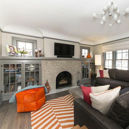
Orange:
Orange hues are bright, fun and energetic. Since orange is a combination of red and yellow, it makes sense that it would have all the vivacity and warmth of both. Used in large quantities, orange can feel overwhelming, but softer peachy or terra cotta shades can be cozy and calming.
Red:
Red can be bold and dramatic or warm and earthy, depending on the tone. Deep crimson hues create passion and drama, while rusty shades can add a cozy ambience. Red is best used in areas where energy should be high, like a family room or entertaining space.
Yellow:
Yellow is usually associated with sunshine, energy and happiness. It reminds me of my last vacation to Mexico. It also can spark creativity and encourage communication, which might help if you have teenagers at home! But if it’s overdone, it can cause anxiety and stress.

Green:
Green brings to mind nature, balance and harmony. Deep emerald or hunter green can add intensity and elegance, while light spring or sage green is soothing and helps stimulate focus and creativity.
Blue:
Blue tones are typically associated with calm and serenity. It’s a great color for spa-like bathrooms and peaceful master bedrooms. Deep navy or royal blues add a masculine feeling, while light powder or sky blue hues are versatile anywhere you need a bit of relaxation.
Purple:
Purple has long been the color of royalty, and can inspire creativity and spirituality. Deep rich plum or violet can add a bold, exotic flair, while light lavender hues are calming and pair well with grays and oranges. It’s also a popular choice for kids’ rooms – studies have shown that nearly 75% of pre-adolescent children choose purple over any other color.

Pink:
Pink can add a touch of feminine flair, and it has seen a huge increase in popularity over the past few years, with blush and ‘millennial pink’ shades being in vogue. Muted blush or grayish-pink hues can instantly soften any room, and darker shades of magenta add a punch of drama.
Black:
Just like my favorite little black dress, this color has always been associated with sophistication, elegance and luxury. It’s most often used as an accent in the home, as all-black interiors can become dreary and overwhelming very quickly. Glossy or matte black accents, furniture and appliances are timeless and chic.
White:
White is the color of purity and cleanliness, and often is regarded as a blank palette. With the rise in popularity of Scandinavian design in recent years, more and more designers are leaning towards all-white walls and sparse white furniture. White interiors can feel fresh and modern, but can also be very cold and barren without the proper accent pieces.
Brown:
Brown accents such as wood tones, leather, and natural elements are a great way to warm up a space and make it feel homier in an instant. Brown shades are truly versatile, and go with any design style and mood.
At the end of the day, it’s important to choose colors in your home that speak to you. Be sure to consider the purpose of each room and how you want people to feel while they’re in it.

Share


You Might Also Like


Find us on Instagram