11 Tips for Wall Art Arrangements
October 26, 2015
Creating a beautiful arrangement of artwork on a wall can be stressful when you have multiple pieces, but relax! Here are some tips from me and my friend and framing guru John Timony, owner for the past 8 years of Curtis Frames in Libertyville.
Creating a beautiful arrangement of artwork on a wall can be stressful when you have multiple pieces, but relax! Here are some tips from me and my friend and framing guru John Timony, owner for the past 8 years of Curtis Frames in Libertyville. First let’s hear from John:
SB: Any tips for deciding how to arrange a grouping of artwork of photos?
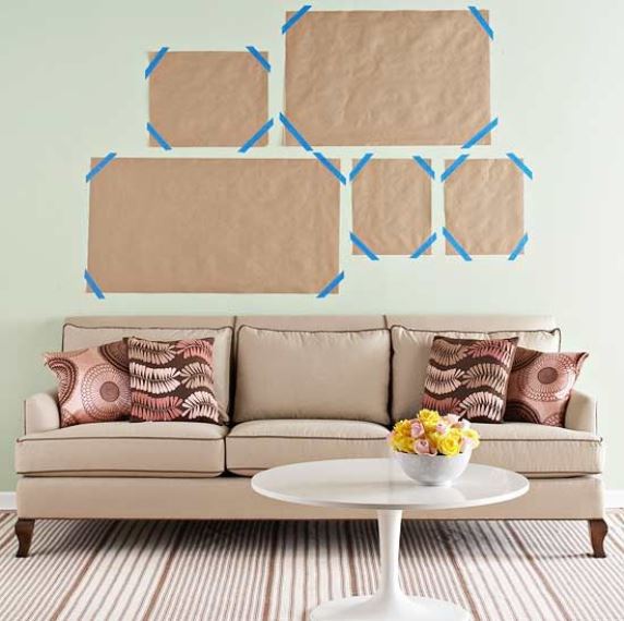
JT: Before we frame our clients’ art we cut out pieces of cardboard in the size of frames we would recommend. They take home the cardboard cutouts and they can either start by creating various groupings on the floor of the room where the art will hang and then testing them on the wall, or they can just start experimenting on the wall using some removable adhesive such as Sticky Tac. It is much easier to rearrange cardboard than pieces of art!
 Photo Courtesy of bhg.com
SB: What’s best - an even or odd number of pieces in a grouping?
JT: Typically odd numbers are more appealing than even, but we often do even groupings too. Sometimes a square or rectangle is just right.
 Photo Courtesy of Sweet Peas Design
SB: Should all the frames match?
JT: You can go either way, depending on the art and the room, but if the frames are different they should work together. Sometimes we suggest having two frames the same and one different, or you can use the same frame on two pieces in different widths.
 Photo Courtesy of Sweet Peas Design
SB: Where should we place larger pieces versus smaller ones in a grouping?
JT: Visual balance is very important. As a general rule, keep heavy pieces to the bottom and left. It balances the weight of the items because the eye starts on t he left. If you have an even arrangement, put the heaviest piece in the middle.
SB: What is the rule of thumb for mat width?
JT: We recommend that the mat be 1 ½ to 2 times the width of the frame. When the mat is wider than the frame it draws the eye to the art, and the art won’t look crowded.
 Photo Courtesy of Sweet Peas Design
SB: What’s the best way to match frames and mat to the client’s décor?
JT: We allow people to take frames and mat boards home – a lot of places won’t do that – because the décor and lighting in your home can change the way colors appear. It’s the same with paint color. You can choose a great color at the store during the day, but when you get it home it might look awful at night.
SB: What’s the biggest mistake people make in hanging art?
JT: Hanging it too high! As a general rule artwork should be positioned at eye level for an adult of average height, or take the average of the adults in the house. If the husband is 6 feet tall and the wife is 5-foot-5, take the average eye level of the two.
 Photo Courtesy of apartmenttherapy.com
SB: Those are all great ideas, John, and here are some of my tips:
- I like to add a narrow, decorative piece of molding called a fillet when framing artwork. We place them on the inner edge of a large frame or between mat boards to help draw attention to the artwork.
- I prefer a reverse bevel for mats, which runs inside instead of out, and hides the colored core (white, black or off-white) that is in the center of the mat.
- Double matting is my go-to because it looks more finished and professional and because I can add a narrow strip of subtle accent color.
- Typically I avoid dark mat colors, except black. I prefer whites, creams and taupes. Let the artwork speak!
Are you starting to feel like a pro? Soon your walls will be as well laid-out as an art museum!

Share


You Might Also Like


Find us on Instagram